We make everyone talk about your brand
How?
At CHAN! we practice comprehensive strategic Marketing. This means that our actions are always aligned with our client’s commercial goals. We measure them afterwards, in order to obtain valuable information regarding our clients decision making process.
CHAN! is an strategic partner for all clients. We have a multidisciplinary team focused on every task we are challenged with.
During the first meeting with the client, we make a diagnosis of the communicational problem and then we establish the basic steps to follow. After that, we take care of our client’s brand identity, in both visual and communicational aspects.
Design and creativity are fundamental axes of our work. Our technique and expertise allows us to make your brand stand out from competitors, and we go one step further: we make everyone talk about your brand.
We believe that clear objectives and teamwork are key to good results. Communication is one of CHAN! strengths and this adds value to our work.
Online and offline integration is a must at CHAN! Marketing is a complex science that must be integrated to the operation at its full potential, so isolated actions will not do much unless they are part of a whole.
Some of CHAN! areas involve event organization, press, BTL, trade, social media, display and web development. We assist all our clients with one clear objective: effectiveness, which means obtaining the best results maximizing investment.
Monthly reports are sent to our clients showing the effects of the strategy and actions taken during a specific period. All reports are designed to support our client’s decision-making process.
Finally, we generate word-of-mouth recommendations from our clients to potential ones. Our actions speak for ourselves, we make our clients great and that makes us great too.
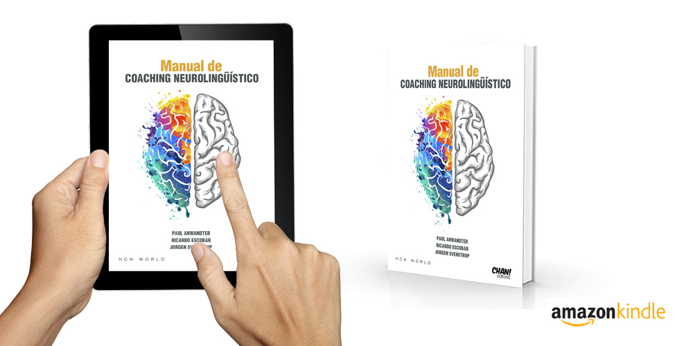
Campaign Nane: Digital design and layout of HCN World Neurolinguistic Coaching Manual
Campaign Objective: To promote HCN World Certification, and distribution to students
Support: Digital book (ePub) for sale at web plataforms and Kindle
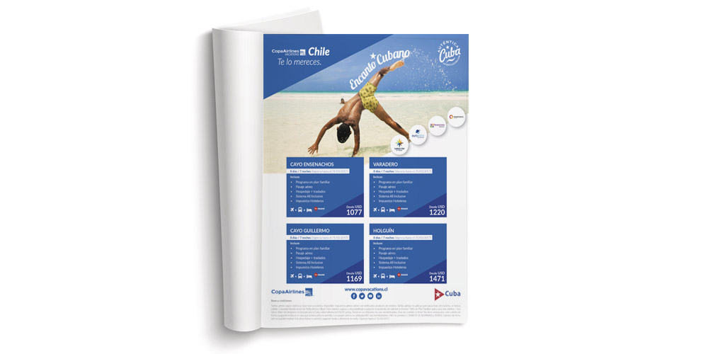
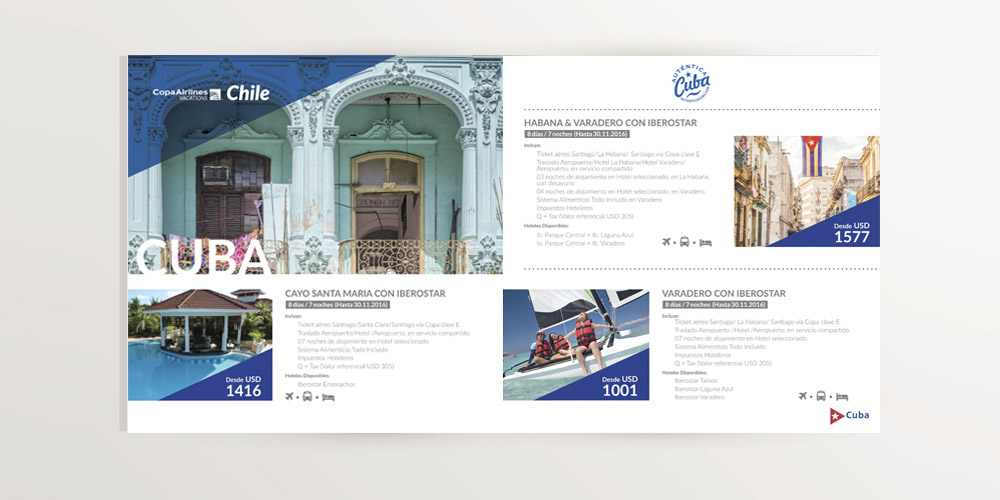
Advertisement at Las Ultimas Noticias – Copa Vacations Chile
Promote new destinations in Cuba.

Trustpro
Campaign: Corporate identity
Objective: To create a corporate image that represents the values and objectives of the company.
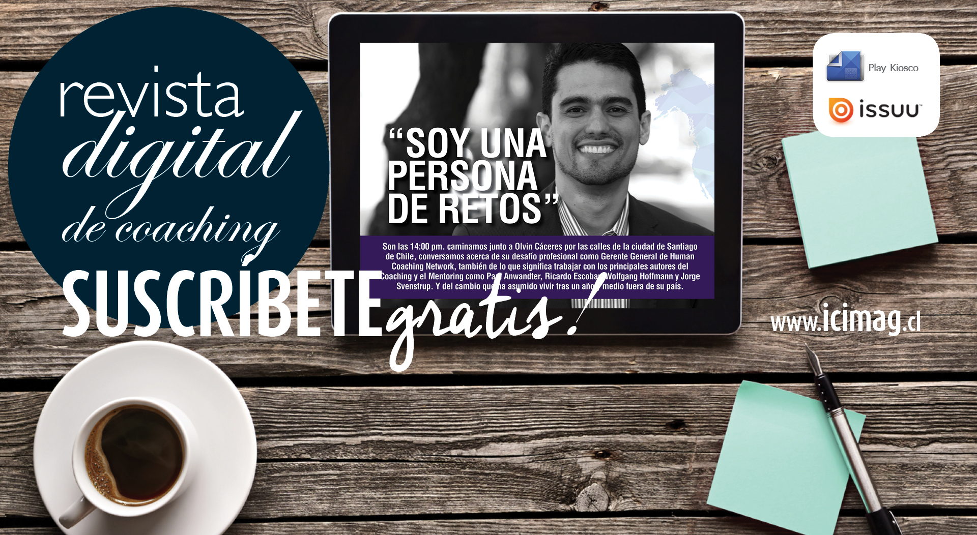
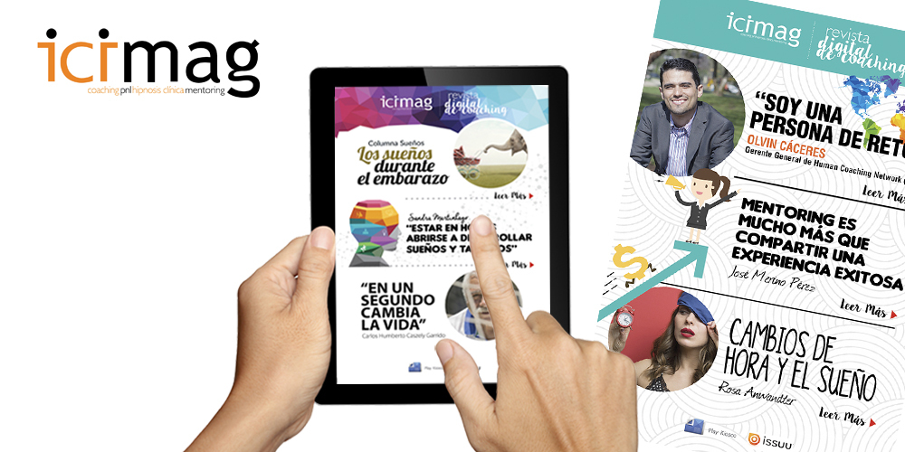
Icimag
Campaign: Icimag, bimonthly coaching magazine
Platform: digital format
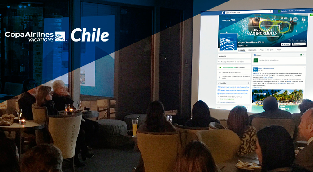
Copa Airlines Vacations Chile
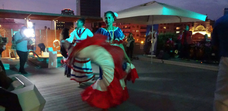
Campaign: Copa Sunset and Dominican Republic
Objective: To create awareness of the Dominican Republic. To do we invited Santiago’s travel agents and showed them the best of this beautiful country.
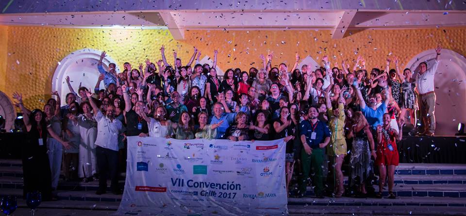
VII Convention Copa Airlines Vacations Chile 2017
With the aim of publicizing the Riviera Maya destination, with its tourist attractions and hotel offerings, Copa Airlines Airlines and Copa Vacations Chile operators pool and convened more than 100 people from all over Chile, including travel agents, representatives of destinations, and press to a trip of pure networking and learning for 6 days. There were workshops, walks, parties, and much more.
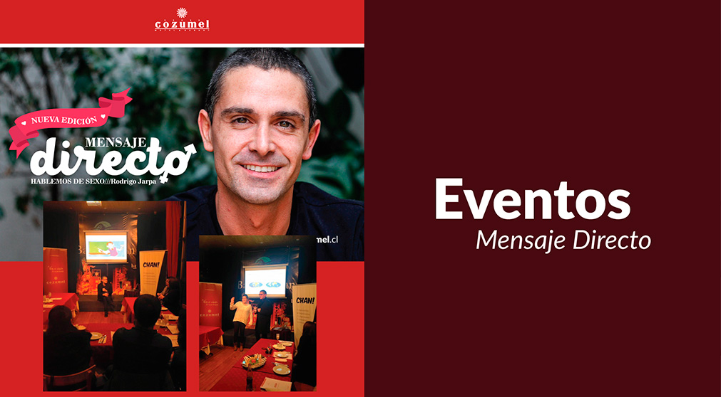
Cozumel
Campaign:“Direct Message” with Rodrigo Jarpa.
Objective: Series of sexual education talks. The aim was to raise brand awareness and engage with them as CSR.
Luna, lanas y Estrellas
Campaign: Corporate Identity
Objective: Create a corporate image that represents the values and objectives of the company
Inpact
Objectives: Position Inpact S.A. within the Chilean banking market..
Cozumel
Campaign: Positioning SEO
Platform: web
Objective: To position and increase visits to the website. Visits during the last 3 months have been by an average of 30.000 visits per month.
Campaign: Positioning in Socialmedia
Objective: Creation of an account for Decameron Chile, in order to position their different touristic destinations, as well as to increase the community generating content of value to the audience.
Corporate Identity: Comunica
Campaign Objective: To create corporate image representing company values and Objectives
Paul Anwandter
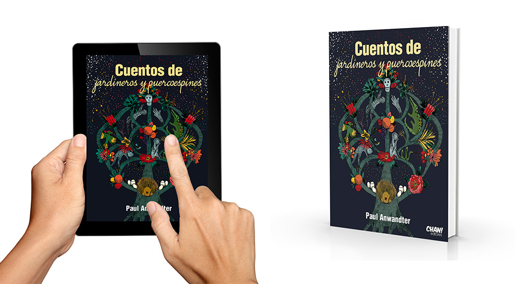
Campaign: design and layout of both printed and digital versions of the book “Tales of Gardeners and Porcupines” (Epub)
HCN
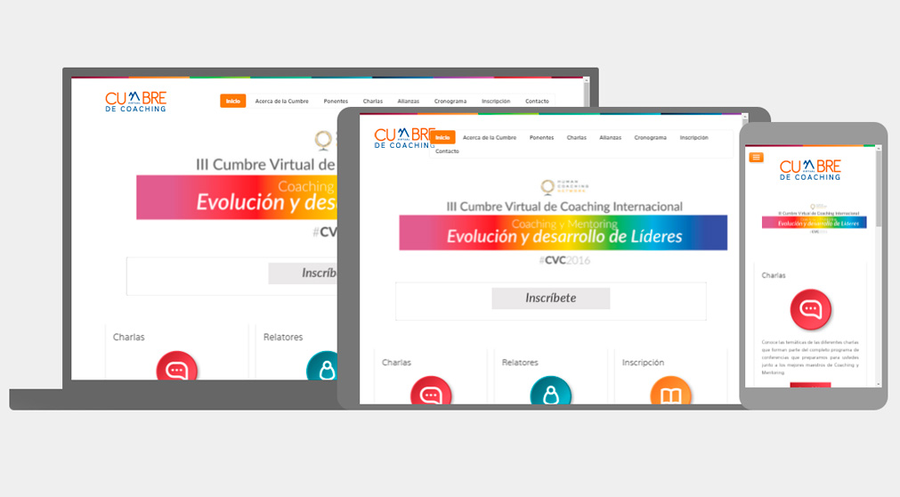
Campaign: Virtual Summit of Coaching 2016
Objectives: To sell tickets for the Virtual Summit of Coaching
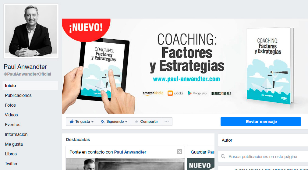
Paul Awandter
Campaign: Paul Anwandter’s positioning in Social Networks
Objective: To increase the number of followers, and thus, position the Brand in social networks. We achieved 40,000 followers and we keep counting!
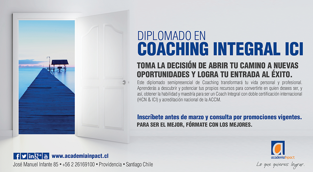
Campaign: Academia Inpact – Coaching Integral
Objective: To increase the number of participants at the Coaching Integral Diploma as well at the rest of Inpact‘s Academy courses.
Platform: Social Media, Web, Mailing, Press
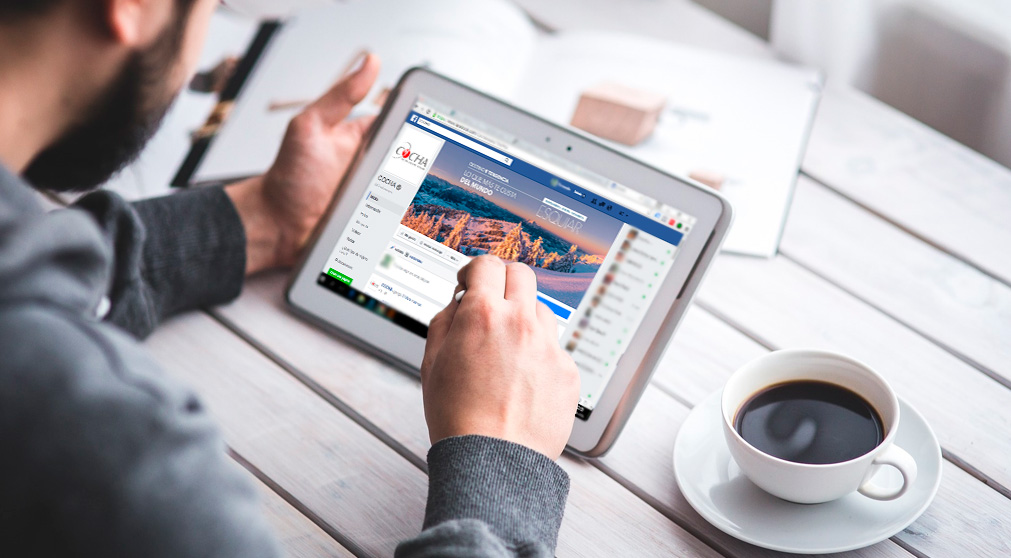
Cocha
Campaign: strategy on Social Media
Objective: To increase the community and brand interaction. And to improve response times.
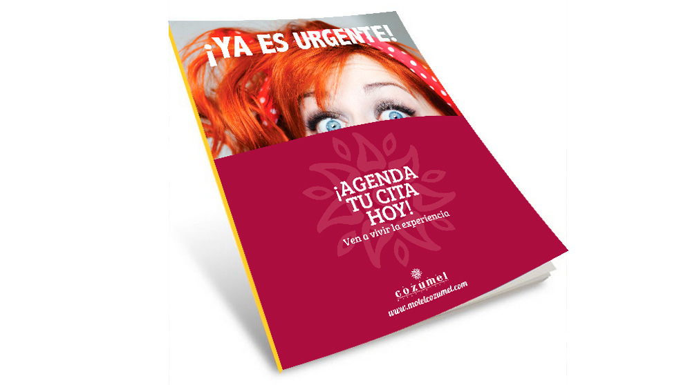
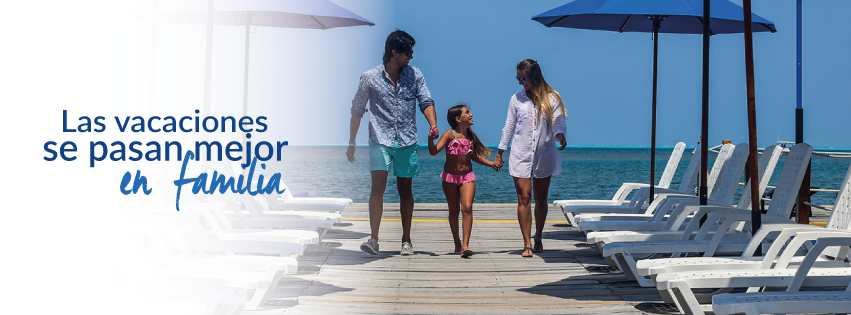
Cozumel
Campaign: I´m a Woman
Objective: To position Motel on the female segment and allow the brand to advertise on printed media.
Magazine Icimag
Campaign: Email MKT
To promote magazine’s new edition, Massive sending to database
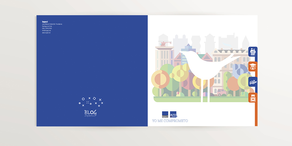
Inpact – Alto Inpacto
Campaign: Alto Inpacto Digital Cataliog
To show in web page new benefits to employees
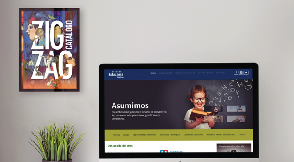
Educaria
Campaign: New Web Site
Objective: To improve both Educaria’s web design and user experience to increase the number of visits to the website and the time spent by its users.
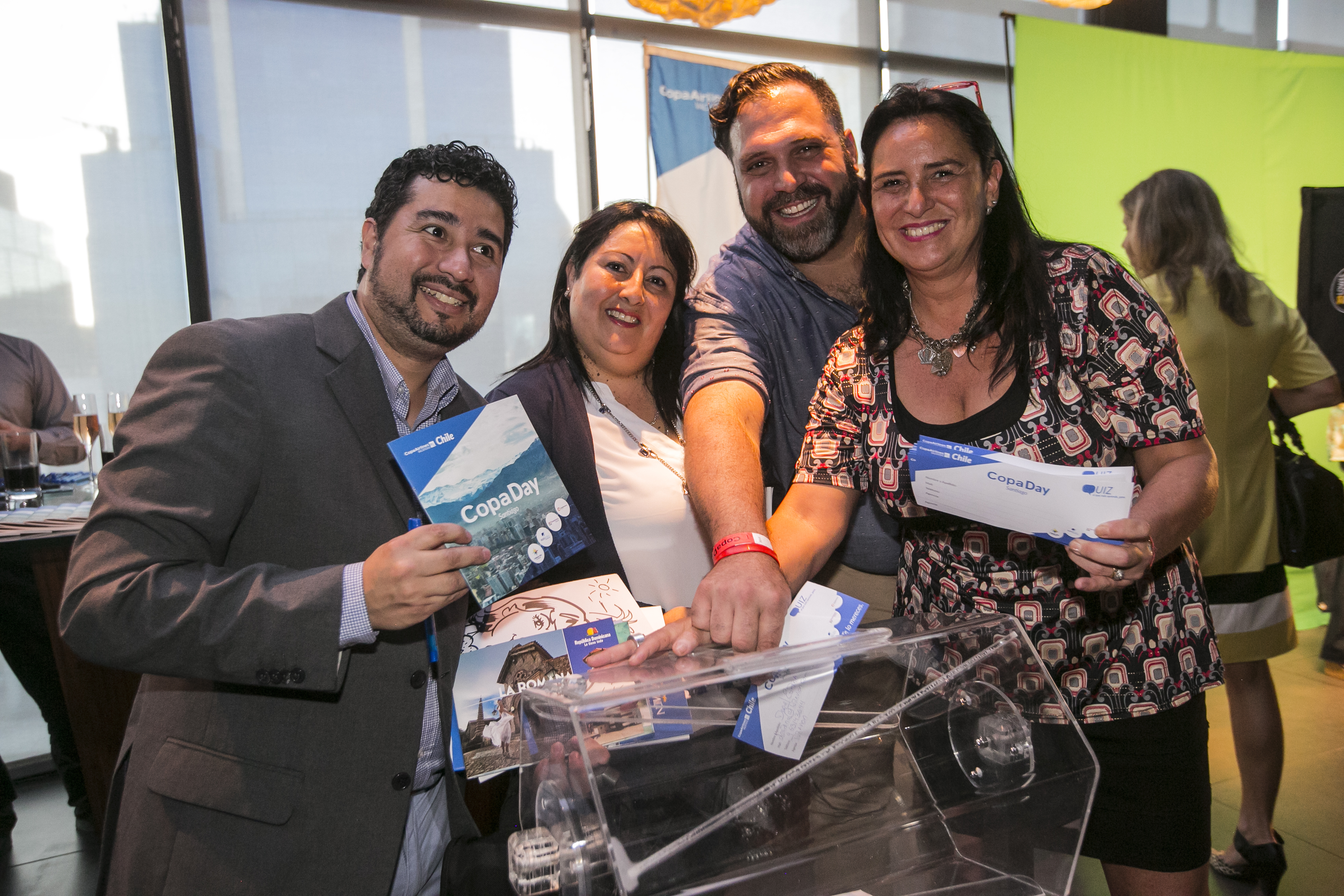
Copa Airlines Vacations Chile
Campaign: QUIZ
Objective: To attract attention from travel agents by means of a trivia on exhibitors, destinations and hotels to win, in teams, a great reward during Copa Day.
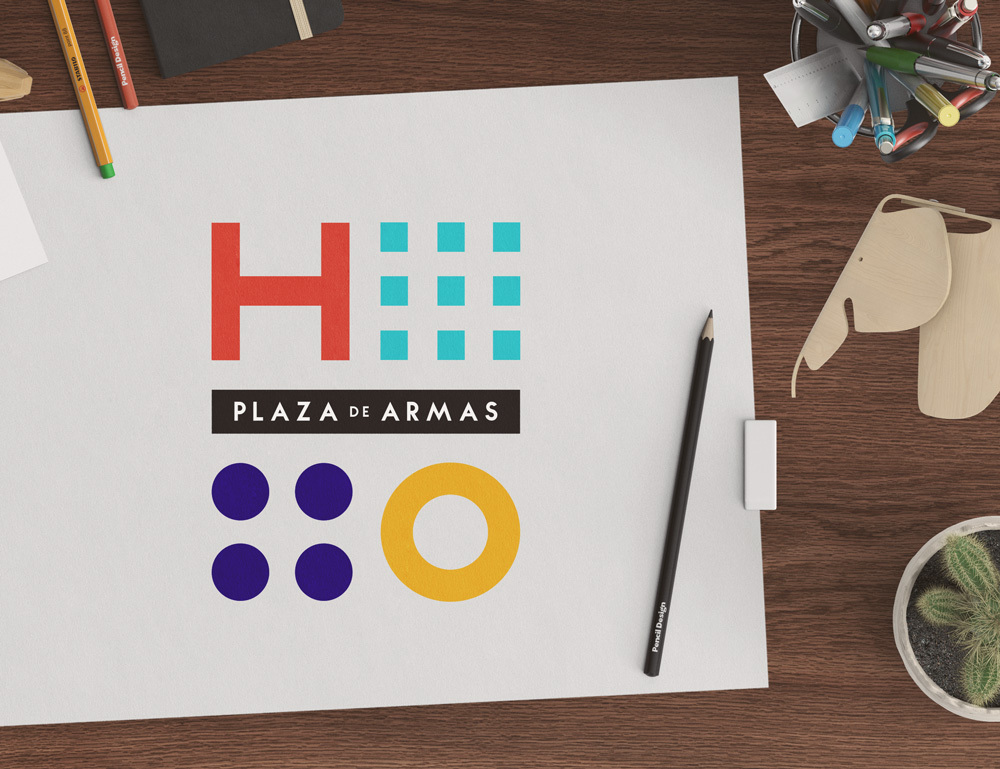
HOSTAL PLAZA DE ARMAS
Nombre campaña: Campaña full!
Objetivo de campaña: Crear identidad de marca, imagen corporativa, ambientación y señalética
soporte: varios!
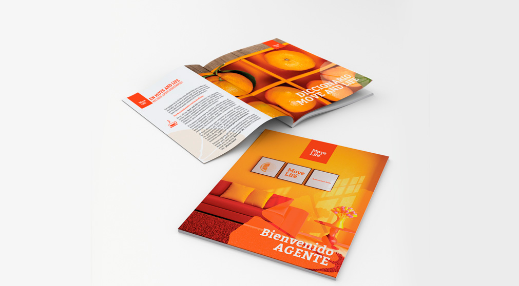
Move and Life
Campaign: Welcome Manual
Objective: Welcome new agents
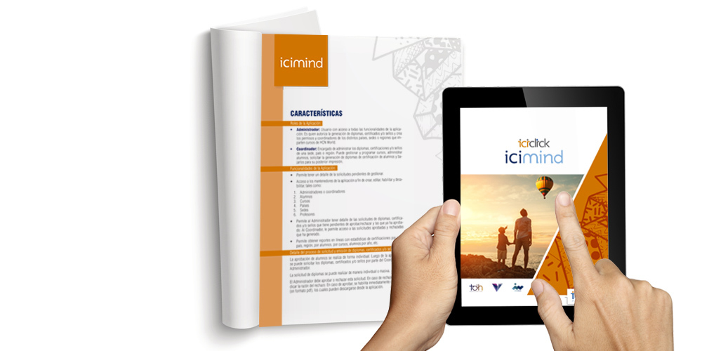
Campaign Name: design, layout and editing of Iciclick catalog – Inpact
Campaign objective: To offer this service to the public
Support: Printed and Digital
Copa Airlines
Campaign: Sunset Copa
Objective: Official launch of the 2016-2017 Marketing Plan.
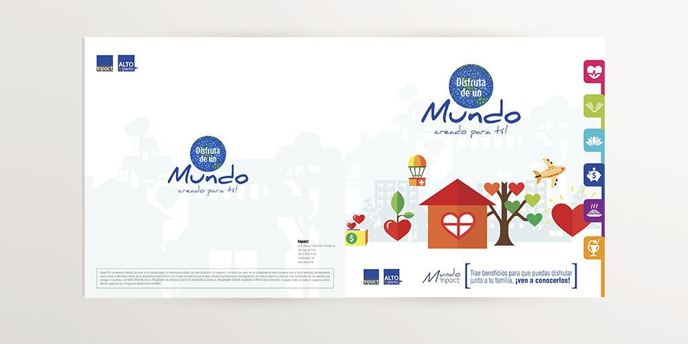
Inpact – Mundo Inpact
Campaign : Mundo Inpact Digital Catalog
To show on web page new Beneficial Partneships for employees
Copa Vacations Chile Brochure
Design of the official 2016’s Copa Day Chile brochure, with special tourist packages and destinations.
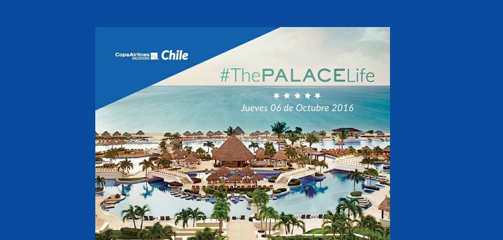
Copa Airlines Vacations Chile
Campaign: Training Palace
Objective: Dynamic training addressed to travel agents regarding the benefits of the services of Palace Resorts.
Videos
CHAN! brands
Hostal Plaza de Armas
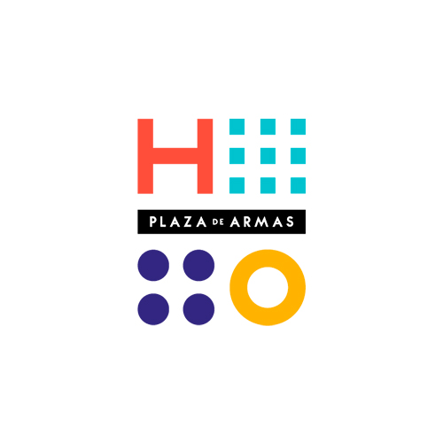
It is a versatile, modern, flexible and full of passion logo.
Represents through its grid an aerial view of the square and KM 0 highlighting its privileged location and the panoramic view that the building has. The typography chosen maintains the family of public road signs characteristic of the other properties of the group.
Hostal Plaza de Armas is a modern brand that allows disarming in categories and adapts to each type of client. Its colors generate a space of coexistence and connection where we can enjoy relaxed environments and other more energetic.
Pino Haus

The logo was redesigned under a new concept that shows quality, strength and innovation. The criterion chosen for this change was transmitting a new image with much more clean and clear of message. The solid and clear typography shows brand weight and strength in the category and the logo is coherent with the aesthetic defined by the area of business. Whenever the brand speaks, it shows who it is and what has to offer. Consistent and regulated use of the logo will reinforce this concept achieving greater strength in the market. The original brand will be used in all communications, whether corporate, promotional or cobranding.
Access Blue
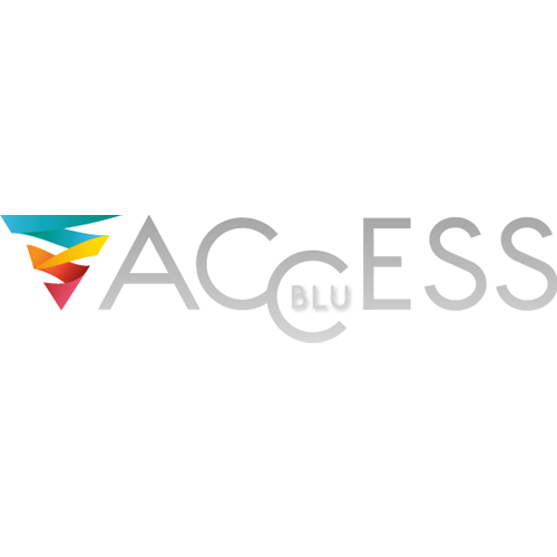
Access Blu is a company that complies with standards of quality and competence. With this logo we suggest the provision of the best service so that you get the necessary tools to access your internal resources, both in your personal and professional life, in order to make the appropriate changes for better performance.
The logo of Access Blu represents the idea of world, connectedness, balance, enlightenment, novelty.
Casa Munay
Casa Munay is a brand aimed to women which trnasmits confidence and thanks, to its simplicity, it is noweasily recognized in different applications, sizes and distnaces.
Giras Panamericana
The logo shows a road with thousand turns, which adapts to the dreams and projects of each person because each trip is unique. Its frame shows the years of expertise of Panamericana Tourism in creating unforgettable experiences that will remain forever in the memories of those deploying their services.
HCN WORLD
For the character of the logo and the full texts, was raised a typography sans serif, with defined and symmetrical paths.
Color palette was worked to generate balance, seriousness and professionalism. Consistent use and regulated resforzara this concept achieving greater strength in the market.
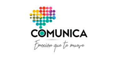
Comunica
With this new image COMMUNICA is reborn to stand out in the market as a company IN MOVEMENT, connecting its EMOTIONS, and objectifying its IMPACT to generate in the clients the confidence of THE TRANSFORMATION. Looking for motivation and strength, combined in a range of multiple colors, simple identification and readability, we developed a cheerful, versatile and different brand that allows easy visual and digital application, adapting to all media and possible applications.
APNL
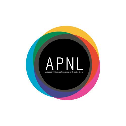
APNL is a company that needs to comply with standards of quality and competition. In the area of Human Development, this logo shows guarantee of best service offering tools so you can access to your internal resources, in order to make the necessary reframing to make changes that will give satisfaction to your life.
We work with